New Interface
wayahead has a new interface! There is now more room on the page for the information that really matters: your reports! Especially on smaller the difference will be significant. And the new wayahead house style colours get a more prominent place!

The old layout had a wide side panel, where the user would choose a report from the list. Additionally, the old interace had quite some padding around the content of each page.
In the new version, the side panel has been reduced to a minimum, with collapsible menu’s as you hover over each reporting section. The space around each page has also been minimised, leaving maximal screen real estate for the actual report!
The user menu, setup menu and support were moved to the bottom left corner of the page, making it consistent, not just with other modern day interfaces, but mostly with that other one you are so familiar with: Streamtime. Of course, the setup menu will still only be available to company administrators. This puts everything together in the most obvious location on the page.


News
![Google Sheets Report]()
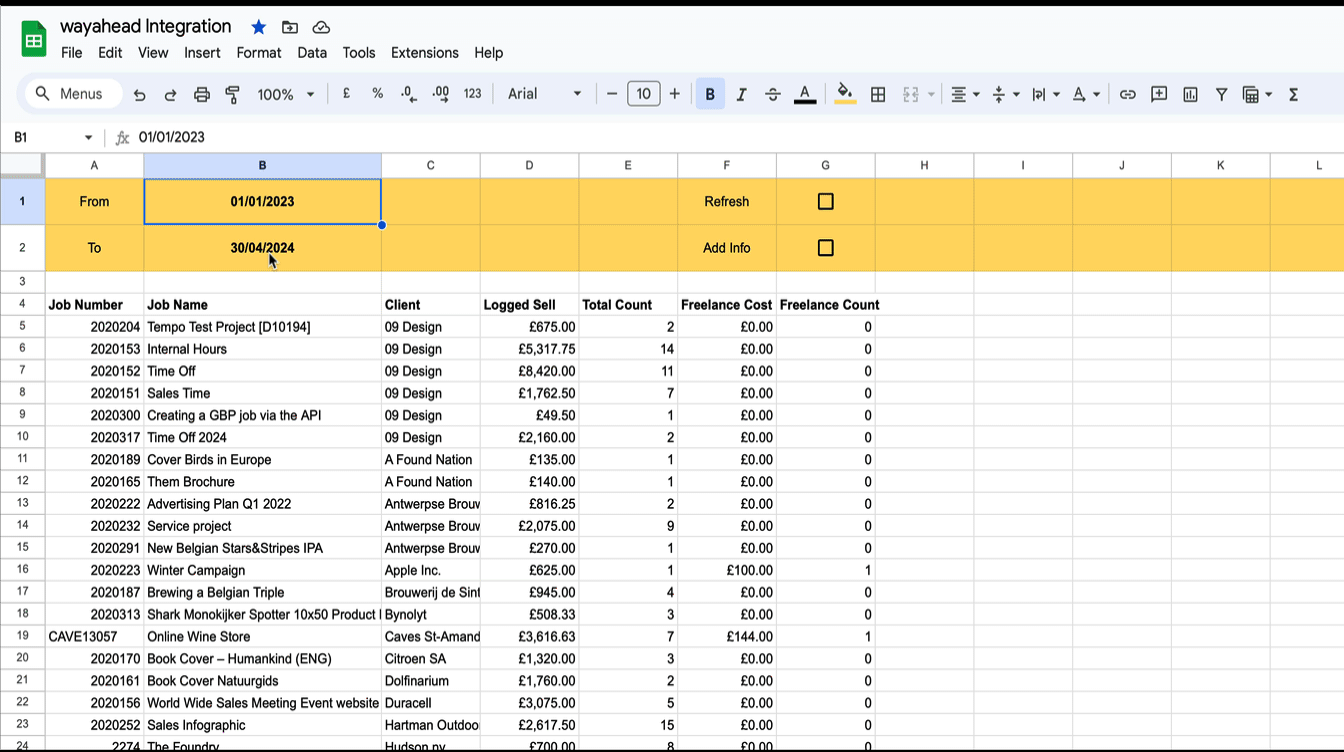
Reporting in Google Sheets
You can use Google Sheet's built in functions to create your own custom reports with Streamtime data that's always up to date. Importhtml simply calls a website/web app and fills in the returned table in the sheet.
New Interface
wayahead has a new interface! There is now more room on the page for the information that really matters: your reports! Especially on smaller the difference will be significant. And the new wayahead house style colours get a more prominent place!