Product Update: Improved Utilisation Report
The Staff Utilisation report is meant to show you information about recorded time for one week from every possible angle, breaking down the time by person, by category, by date and so on.
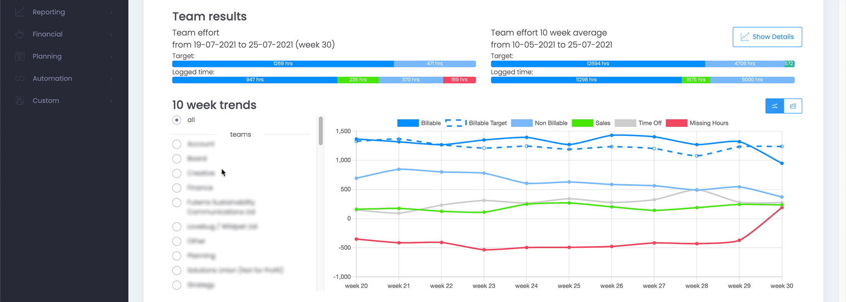
The old preference for loading the 10 week trend – a summary of total time tracked across 10 weeks – has been replaced with a smarter and more detailed system.
First of all, the preference is gone. Rather than always or never loading the 10 week trend, this is replaced with a button where you decide exactly when you wish to load this data heavy information. Once the data is loaded, it is processed and broken down by category, so you have a lot more insightful information about trends over the last 10 weeks.
The graph can either be displayed as a simple line graph or as an area chart, where the different values are stacked up together for even more insights. Toggles on the side, let you choose to view the graphs for all staff, per team member or by individual, giving you detailed information, e.g. about who is consistently missing timesheets, who is meeting their billable targets or who is doing heaps of overtime.
News
![Google Sheets Report]()
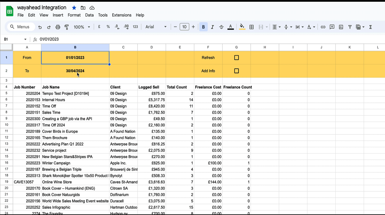
Reporting in Google Sheets
You can use Google Sheet's built in functions to create your own custom reports with Streamtime data that's always up to date. Importhtml simply calls a website/web app and fills in the returned table in the sheet.

New Interface
wayahead has a new interface! There is now more room on the page for the information that really matters: your reports! Especially on smaller the difference will be significant. And the new wayahead house style colours get a more prominent place!